
Thumbnail Improver: Transforming Boring Images into Click-Magnets
Imagine spending ten hours researching, filming, and editing a video, only to watch it sit at 0 views. It’s the ultimate creator heartbreak. In most cases, the video isn’t the problem—the 'entryway' is. Your thumbnail is the front door to your content, and if it looks boring, nobody is coming in.
In 2025, the competition for attention is fiercer than ever. With millions of videos uploaded daily, your thumbnail doesn't just need to be 'good'; it needs to be a 'click-magnet.' This is where a thumbnail improver comes into play, turning standard images into high-performance assets. In this guide, we’ll break down the science of why some thumbnails fail and how you can use tools like Thumbnail AI to dominate the feed.
The Click-Through Crisis: Why Your 'Good' Thumbnails Are Failing
Many creators fall into the trap of making 'pretty' thumbnails that lack a psychological hook. A beautiful landscape or a well-lit photo might look nice, but does it create a 'curiosity gap'?
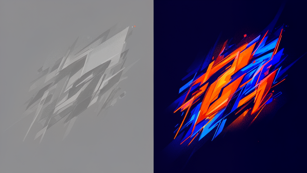
A common mistake is clutter. When you try to show everything in the video within a tiny rectangle, the viewer's brain becomes overwhelmed. In a split second of scrolling, they skip your video because they couldn't immediately identify the value. A high-performing thumbnail needs a clear focal point. If your thumbnail rater or thumbnail analyzer shows low clarity scores, you're likely losing thousands of potential clicks to clutter. The goal isn't to summarize the video; it's to promise an outcome or pique an interest.
Color Psychology: Using High Contrast to Dominate the Feed
YouTube’s interface is primarily white or dark mode grey. If your thumbnail uses muted, 'natural' colors, it will blend into the background. To stand out, you need to leverage high contrast and complementary color schemes.
Think about colors like neon orange against a dark blue background, or bright yellow text on a purple field. These aren't just aesthetic choices; they are biological triggers. Our eyes are naturally drawn to sharp contrasts. When using an ai thumbnails generator, always prioritize vibrant saturation. You want to create a visual 'stop sign' that forces a thumb to stop scrolling.
Pro Tip: Look at the Thumbnail AI heatmap features to see which parts of your image are grabbing the most attention. If the focus isn't where you want it, it's time for a redesign using a proper thumbnail improver workflow.
The Human Element: Why Faces and Emotion Drive CTR
Humans are hardwired to look at other humans. Specifically, we look at eyes and facial expressions to gauge intent. This is why MrBeast and other top creators often use exaggerated expressions of surprise, fear, or excitement.
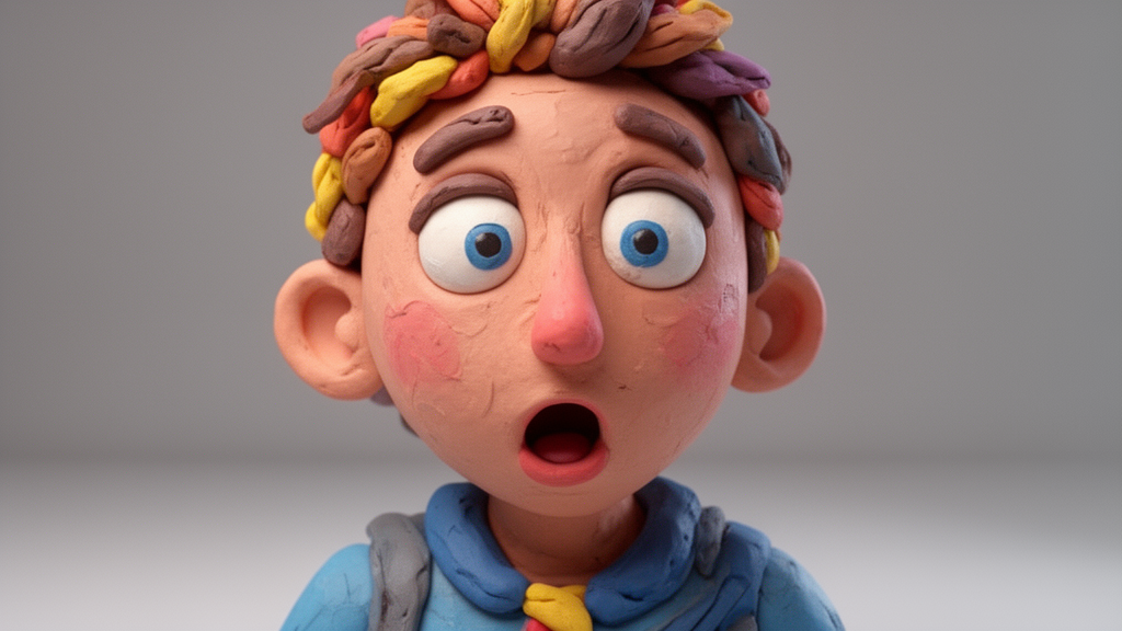
But it’s not just about having a face; it’s about the emotion behind it. A generic smile is boring. A look of 'shocked realization' or 'intense focus' tells a story. It makes the viewer wonder: 'What is he looking at?' or 'Why is she so surprised?'. If you aren't comfortable being on camera, you can use a thumbnail generator to create stylized, expressive characters that represent your brand without needing a photoshoot every time. The key is eye contact or a directed gaze toward the 'object of interest' in the thumbnail.
Textual Minimalism: Winning the 0-3 Word Game
One of the biggest CTR killers is 'The Wall of Text.' If your thumbnail has a full sentence on it, nobody is going to read it. Most viewers are on mobile, where thumbnails are tiny.
The golden rule for 2025? 0 to 3 words.
The text on your thumbnail should never repeat your video title. Instead, it should complement it. If your title is 'How I Made $10,000,' your thumbnail text should say 'IT WORKED' or 'SO EASY.' Use big, bold, sans-serif fonts that are legible even when shrunk down to the size of a postage stamp. A thumbnail analyzer will often highlight if your text-to-background contrast is too low for mobile accessibility.
Mobile vs. Desktop: The Hidden Battle
Over 70% of YouTube views happen on mobile devices. What looks clear on a 27-inch monitor often looks like a blurry mess on a smartphone. This is where many 'good' designs fail the CTR test. When you use a thumbnail rater, it simulates these smaller viewports.
You must ensure that your focal point—whether it's a face or an object—is large enough to be recognized in a fraction of a second. If you have to squint to see what's happening, so will your audience, and they will simply keep scrolling.
Thumbnail AI: The Ultimate Thumbnail Improver for 2025
Stop guessing and start using data. Thumbnail AI isn't just another editing tool; it's a comprehensive platform designed to act as your personal thumbnail improver.
By using the thumbnail rater, you can upload your current design and get an instant breakdown of its emotional impact, contrast levels, and overall CTR potential. Not happy with the score? The ai thumbnails engine can help you generate variations that are scientifically optimized to get clicked. Whether you need a fresh thumbnail generator or a deep-dive thumbnail analyzer, the platform provides the insights usually reserved for million-subscriber channels.
Conclusion: From Boring to Viral
Transforming a boring image into a click-magnet isn't magic—it's psychology and data. By focusing on high contrast, expressive emotions, and radical minimalism, you give your content the chance it deserves. Don't let another great video die because of a mediocre thumbnail. Run your next design through Thumbnail AI and see the difference data-driven design can make. Your CTR will thank you.