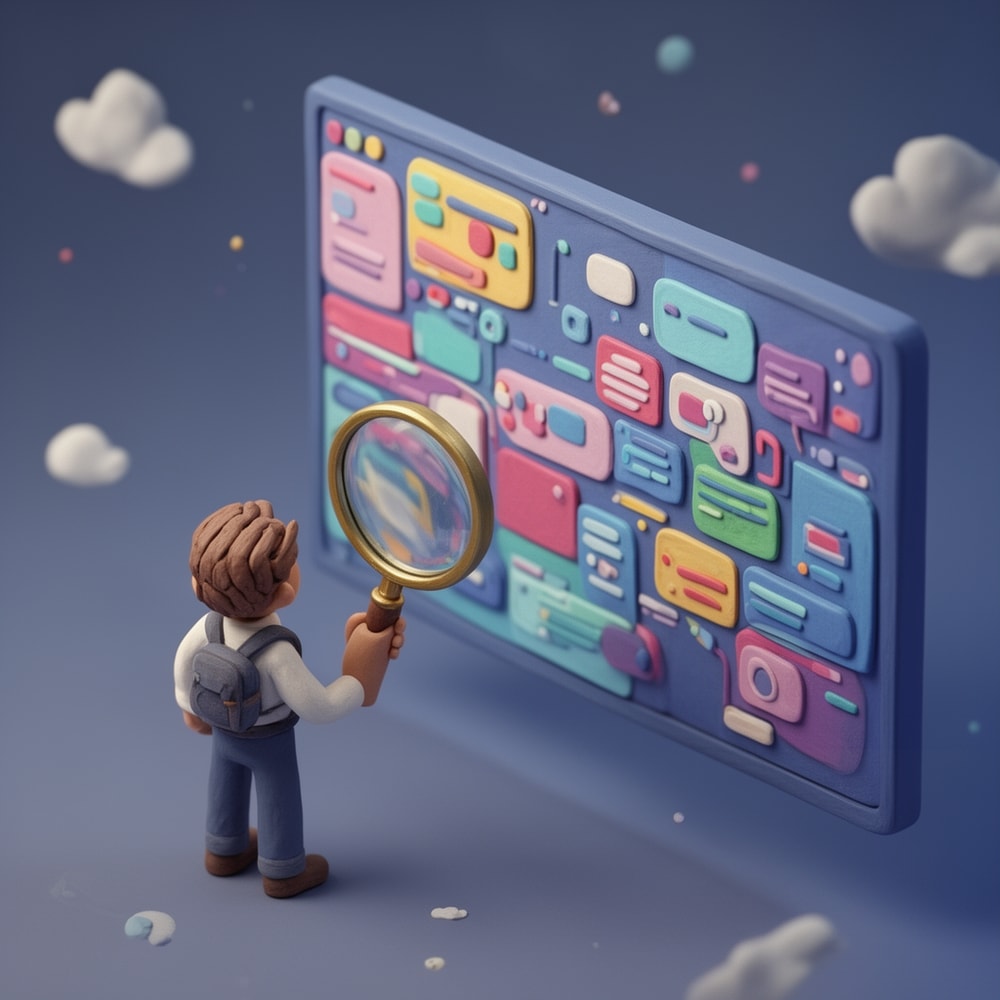
How to Optimize Your Thumbnails for Mobile Users: Small Screens, Big Impact

In the world of YouTube, the battle for attention isn't fought on 27-inch desktop monitors anymore. It’s fought on five-inch glass rectangles inside people’s pockets. Recent data suggests that between 63% and 70% of all YouTube watch time now comes from mobile devices. If your thumbnails aren't optimized for the mobile experience, you aren't just losing a few clicks—you are effectively invisible to the majority of your potential audience.
Designing for mobile is a completely different discipline than designing for desktop. On a desktop, a viewer might see a detailed image with subtle background cues. On a phone, that same image is reduced to the size of a postage stamp. Elements that looked professional in your editing software suddenly become a muddy, unrecognizable mess.
The Small Screen Challenge: Visibility vs. Detail
The biggest mistake creators make is designing for the screen they are working on, rather than the screen their audience uses. When you're sitting in front of a high-resolution monitor, it's tempting to add layers of detail, intricate text, and nuanced color grading. However, mobile users are often scrolling quickly through a crowded feed while on the move, in bright sunlight, or during a quick break.
To win on mobile, you need to prioritize visual hierarchy. This means identifying the single most important element of your thumbnail and making sure it is impossible to miss, even at 150 pixels wide.

High Contrast: The Key to Standing Out
On mobile, contrast is your best friend. A thumbnail with low contrast will blend into the YouTube app's interface (whether the user is in light mode or dark mode). You want your subject to pop off the screen.
Use bold, vibrant colors that contrast sharply with the background. If your subject is dark, use a bright, saturated background like yellow or electric blue. If your subject is bright, use a deep, textured background to create depth. A common trick among high-CTR creators is to add a subtle outer glow or a high-contrast stroke around the main subject to ensure it remains distinct from the environment.
The Science of Legible Text
If you use text in your thumbnails, the mobile rule is simple: Less is more.
Many creators try to fit the entire video title into the thumbnail. On a phone, this becomes unreadable. Aim for three words or fewer. Use thick, sans-serif fonts with heavy weights. Avoid "thin" or "elegant" fonts that disappear when scaled down.
Test this yourself: Shrink your thumbnail to 10% of its size on your computer. If you can’t read the text instantly without squinting, your mobile audience won’t either. This is where tools like Thumbnail AI become essential. By using a thumbnail analyzer, you can get an objective look at how your text and layout perform before you hit publish.
Faces, Emotion, and the Curiosity Gap
Human psychology doesn't change based on screen size. We are hardwired to look at faces, especially those expressing strong emotions. On mobile, where real estate is limited, a close-up face can communicate more than a paragraph of text.
An expressive face creates an immediate emotional connection. Whether it's shock, joy, or intense focus, the viewer should feel the energy of the video before they even read the title. Combine this with a "Curiosity Gap"—a visual element that asks a question but doesn't answer it—and you have a recipe for high CTR.
Mastering the Mobile Preview
YouTube's own Studio app allows you to see how your thumbnail looks, but it doesn't give you the data-backed insights you need to know why it works or fails.
Before you upload, you should ask yourself:
- Is the focal point clear in under 500 milliseconds?
- Is the text readable on a device with 50% brightness?
- Does the thumbnail look better than the three videos surrounding it?
This is where Thumbnail AI shines. It doesn't just show you a preview; it acts as a thumbnail rater, analyzing signals like emotion, contrast, and clarity. It uses AI to predict how viewers will react to your design, helping you find those optimization opportunities that the human eye might miss after staring at the same design for three hours.
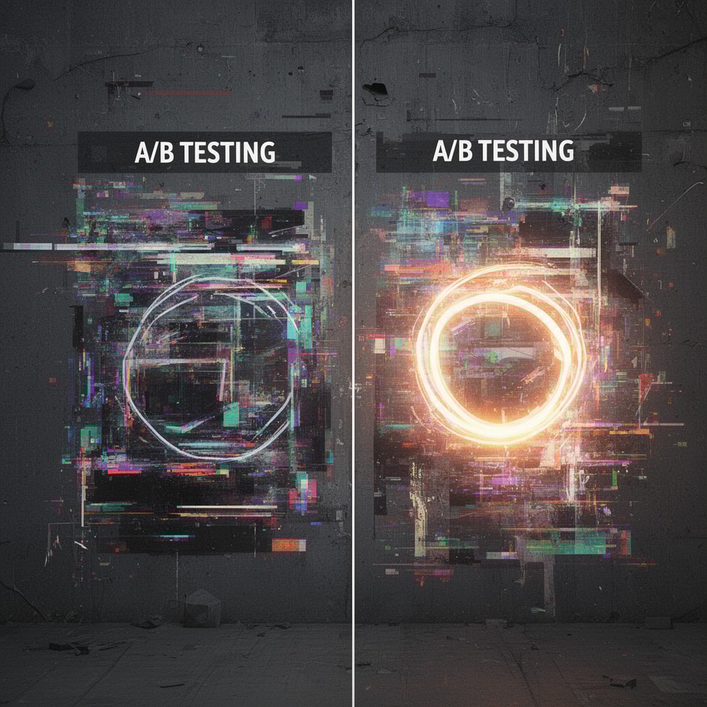
A/B Testing: Data Over Guesswork
Finally, the most successful creators never guess. They test. Even a small change in color or font size can result in a 2% increase in CTR, which could mean thousands of extra views over the lifetime of a video.
By using a thumbnail generator to create variations of your best ideas, you can compare different styles—perhaps one focused on a face and another focused on a graphic—to see which one aligns better with current mobile trends. The goal is to move from "I think this looks good" to "I know this will perform."
Conclusion: Don't Leave Your CTR to Chance
Mobile optimization isn't an optional step in 2025; it is the foundation of YouTube growth. By focusing on high contrast, minimal text, and emotional resonance, you give your content the best possible chance to be seen and clicked.
Ready to see how your current thumbnails stack up? Head over to Thumbnail AI and use the thumbnail improver to audit your channel. Stop guessing, start optimizing, and watch your views climb on every screen size.