The Ultimate Guide to YouTube Thumbnail Text: Less is More?
In the fast-paced world of YouTube, your thumbnail is the digital storefront of your content. You have less than a second to capture a viewer's attention before they scroll past. While imagery is the primary hook, text often provides the necessary context to seal the deal. But how much is too much? In this guide, we dive into the data-backed best practices for YouTube thumbnail text in 2025.
The Golden Rule: Less is Truly More
The most common mistake new creators make is trying to tell the whole story in the thumbnail. If your title already says 'How to Bake a Chocolate Cake', your thumbnail shouldn't say 'Easy Steps to Bake a Delicious Chocolate Cake'.
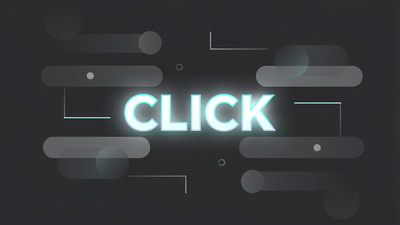
Data suggests that thumbnails with fewer than 12 characters or 0-3 words perform significantly better. Why? Because the human brain processes images 60,000 times faster than text. Large, cluttered text blocks create cognitive friction, causing viewers to skip your video. Aim for a 'Power Word' or a curiosity gap. Instead of a full sentence, try 'SECRET' or 'NEVER AGAIN'.
Mobile First: The Readability Test
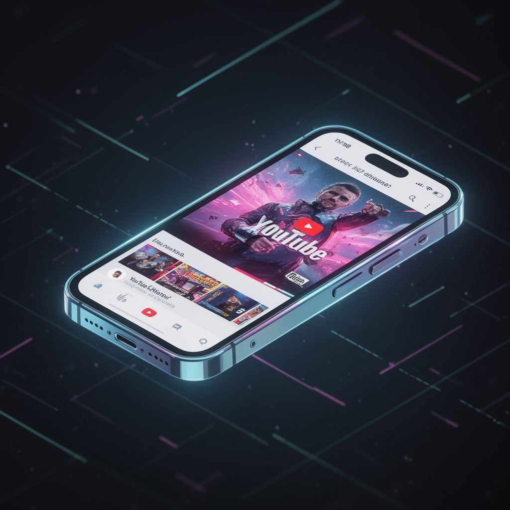
Over 70% of YouTube views happen on mobile devices. What looks clear on a 27-inch monitor often becomes a blurry mess on a smartphone screen. To ensure your text is effective, follow the 75+ Font Size Rule. Your font should be large enough to be legible even when the thumbnail is reduced to the size of a postage stamp.
Using tools like a thumbnail analyzer can help you preview how your design looks at various scales. If you can't read it from three feet away from your screen, your mobile audience won't read it either.
High-Contrast & Bold Typography
Your font choice is your brand's voice. For high CTR, sans-serif fonts are king. Fonts like Impact, Bebas Neue, and Anton provide the weight and clarity needed for quick scanning.

However, font choice is only half the battle. Contrast is the secret sauce. White text on a dark background or vibrant yellow on a dark blue background ensures visibility. Adding a subtle drop shadow or a thick outline can make your text 'pop' against busy backgrounds.
Text vs. No Text: What the Data Says
While instructional and 'how-to' videos benefit from descriptive text, entertainment channels often see higher engagement with no text at all, relying instead on high-emotion faces and storytelling visuals.
The best way to know what works for your niche is to use a thumbnail rater. By analyzing your designs against successful competitors, you can determine if your audience prefers visual storytelling or textual guidance.
Leveraging AI for the Perfect Balance
Finding the sweet spot between a compelling image and readable text is difficult. This is where an AI thumbnail generator becomes an essential part of your workflow. Instead of guessing, you can generate variations, test different text placements, and analyze which version yields the highest predicted CTR.

Don't let your hard work go to waste with a poorly designed thumbnail. Use a thumbnail improver to polish your visuals and ensure your text is doing its job: getting that click.
Conclusion
YouTube thumbnail text should be a garnish, not the main course. By keeping it concise, focusing on mobile readability, and using high-contrast design, you can significantly boost your CTR. Remember, your goal is to create curiosity, not to provide an index.