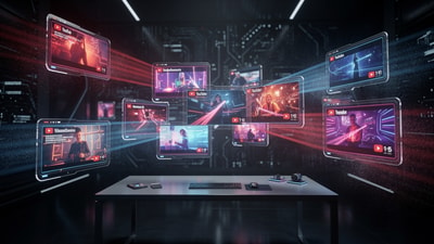
5 Proven Thumbnail Layouts That Stop the Scroll (And How AI Can Help)
In the hyper-competitive world of YouTube, your thumbnail is more than just an image—it's your digital storefront. You can spend weeks crafting the perfect script and hours on meticulous editing, but if your thumbnail doesn't command attention in a split second, your video remains invisible. This is where Click-Through Rate (CTR) becomes the ultimate kingmaker.
To help you win the battle for the click, we've analyzed thousands of high-performing videos to identify the 5 proven thumbnail layouts that consistently stop the scroll. By combining these classic design principles with the power of an ai thumbnail generator, you can move from guesswork to guaranteed growth.
The Visual Psychology of a Click
Before diving into the layouts, it's important to understand why certain designs work. Human brains are hardwired to prioritize visual information that signals novelty, emotion, or a potential solution to a problem. When a user scrolls through their feed, they aren't reading titles first—they are scanning for a visual 'hook.' A high-quality layout reduces cognitive load, allowing the viewer to process the value of your video instantly.
1. The Rule of Thirds & Single Focal Points
A common mistake among new creators is trying to show everything at once. Cluttered thumbnails confuse the eye and lead to lower CTR. The most effective layout often utilizes the 'Rule of Thirds.'
By placing your main subject—whether it's a person, a product, or a vibrant icon—along the vertical lines of the third-grid, you create a natural balance that feels professional and intentional. Using a thumbnail analyzer can help you determine if your focal point is prominent enough or if it's being drowned out by background noise. In 2025, depth of field (blurring the background) is a powerful way to make your focal point 'pop' even further.
2. The High-Contrast Split (Before vs. After)
Humans are biologically attracted to transformations. The 'Before vs. After' layout is a powerhouse because it tells an immediate story without requiring the viewer to read a single word. It creates an 'expectation gap' that the viewer feels compelled to close by clicking.
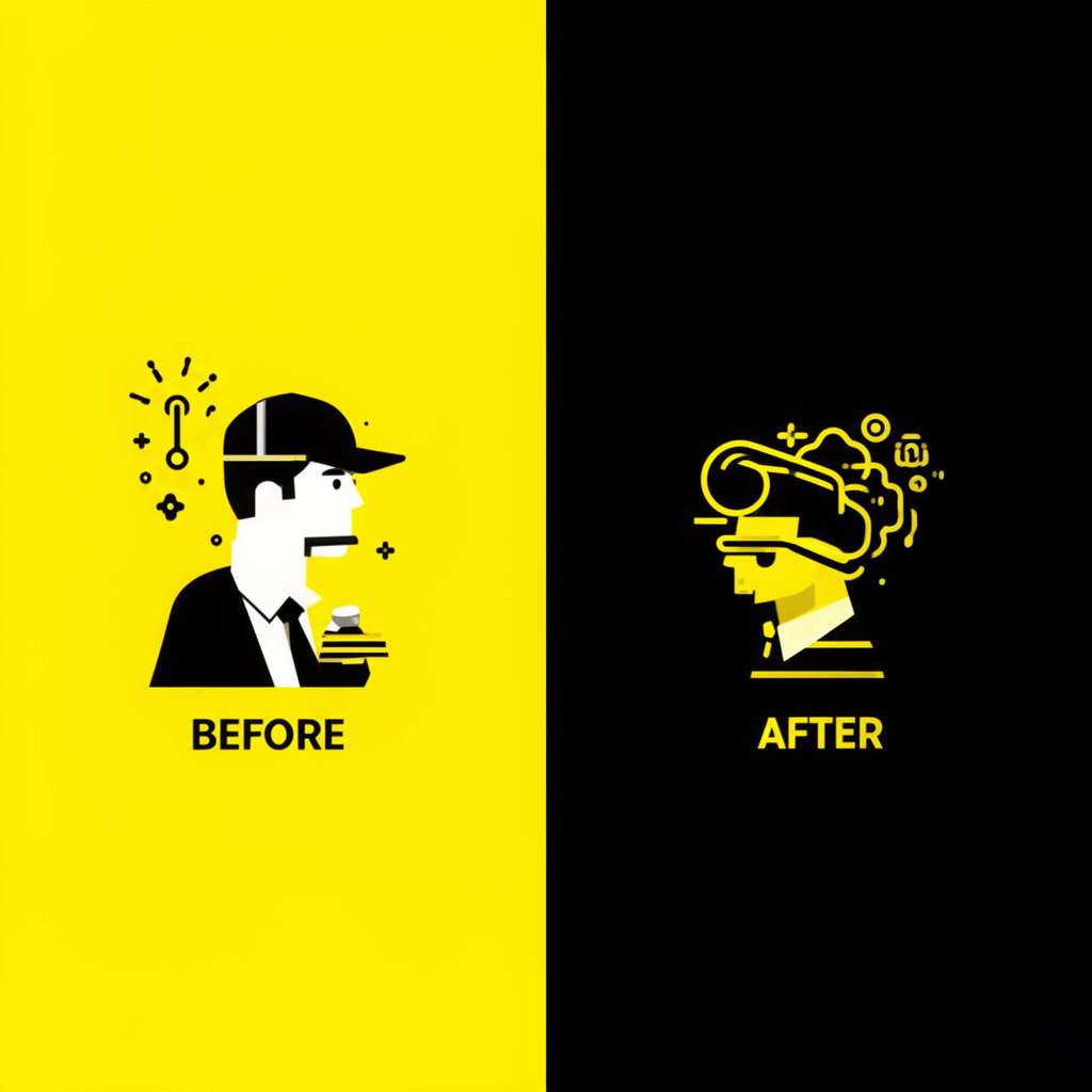
To maximize this layout, focus on extreme contrast. If the 'Before' is dull and dark, the 'After' should be vibrant, glowing, and sharp. If you're struggling to visualize these changes, using a thumbnail improver can help you generate variations that push the boundaries of saturation and clarity, ensuring your transformation looks as dramatic as possible.
3. The Close-Up Emotion (The 'Face' Effect)
Data consistently shows that human faces increase engagement, but not just any face will do. In 2025, 'generic shock' faces are losing their effectiveness. Instead, focus on authentic, high-intensity emotions: genuine anger, pure joy, or intense concentration.
When using faces, prioritize eye contact. The eyes are the first thing a human viewer looks at. Ensure they are well-lit and sharp. A thumbnail rater often evaluates these emotional signals to predict how likely an audience is to connect with the thumbnail on an instinctual level.
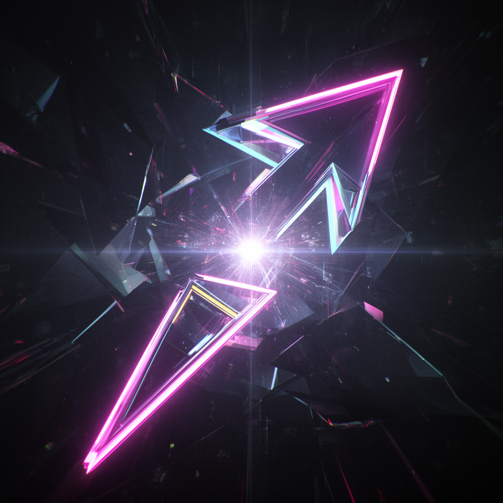
4. The Minimalist Curiosity Gap
Sometimes, the best way to get a click is to say less. The 'Curiosity Gap' layout involves showing an object or a situation that looks slightly 'off' or out of context. By leaving a question unanswered in the thumbnail, you create a psychological 'itch' that only the video can scratch.
Avoid using too much text here. Let the image do the heavy lifting. Use a bright 3D arrow or a glowing circle to highlight the mystery. This layout works exceptionally well for 'How-To' or 'Mystery' niches. You can use ai thumbnails to generate abstract or unique objects that serve as perfect 'curiosity hooks' for your specific topic.
5. The 'Big Text' Mobile-First Strategy
With over 70% of YouTube traffic coming from mobile devices, your thumbnail must be legible on a screen the size of a business card. The 'Big Text' layout uses 3-5 bold words in a high-contrast font (like yellow on black or white on red).
Avoid placing text in the bottom right corner, as the YouTube timestamp will cover it. Keep your text in the top left or center-left. If you're unsure if your text is readable, Thumbnail AI’s thumbnail analyzer can simulate mobile views to ensure your message is crystal clear at any scale.
How AI Transforms Your Workflow
The secret of top-tier creators isn't just that they are better designers—it's that they iterate faster. They don't just make one thumbnail; they test five.
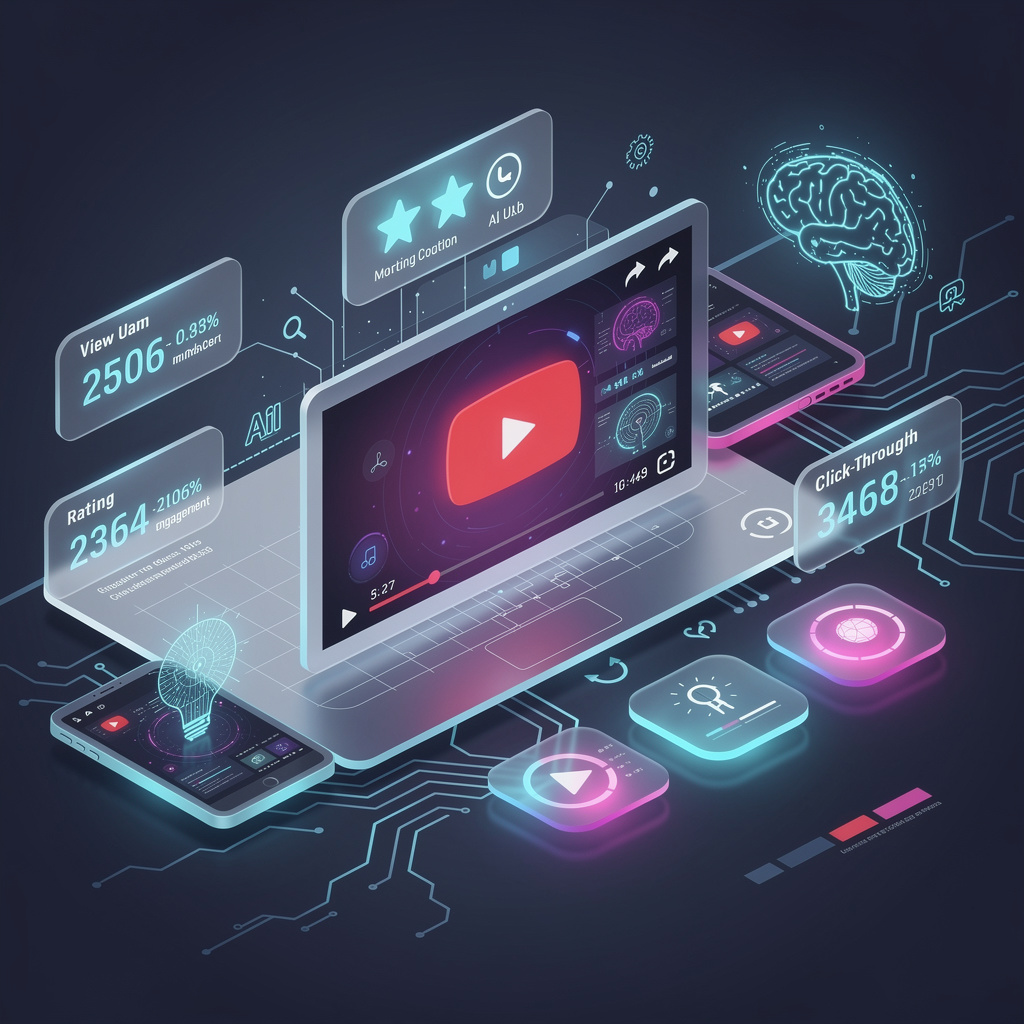
Thumbnail AI acts as your 24/7 creative director. It functions as a thumbnail rater that provides objective data on your contrast, clarity, and emotion. Instead of relying on gut feeling, you can use the thumbnail improver features to automatically generate high-CTR variations of your ideas. Whether you need a new background, a different color scheme, or a completely new ai thumbnail, the tool streamlines the entire process.
Conclusion
Mastering YouTube thumbnails is a blend of art and data. By adopting these 5 proven layouts—the Rule of Thirds, the High-Contrast Split, Close-Up Emotion, the Curiosity Gap, and Mobile-First Text—you give your videos the best possible chance to thrive.
Don't leave your growth to chance. Use Thumbnail AI to analyze your designs, improve your visual hooks, and finally achieve the CTR your content deserves. Stop guessing, and start clicking.